
Gentry 11
Naming
Visual identity
Color palette
Production consulting
Visual identity
Color palette
Production consulting
When looking for inspiration for the name and visual identity of this boutique hotel we looked into the archives of Gosposka ulica, where it is located. Gosposka ulica was a very prestigious street in the past. It also served as a promenade where people strolled on Sundays and holidays to meet friends and new people. The promenade always had the social aspect at its center. However, in the early days, only wealthy people were allowed to promenade.The adjective gentry comes from the old French and is associated with the upper class. The word gentry also contains the word entry, which alludes to the idea of inviting a guest to enter.


The grandness of rooms and the street are already captured in the name, and we wanted to further emphasize it with the shape, colors, and the typeface. At the same time, we sought balance between elegant and modern, homey and urban for the entire identity. The logo is centered on the street name and number, which is an interesting element in itself (with two ones) that we wanted to emphasize. We highlighted it by putting it in a frame that resembles the frames used on house number plates.

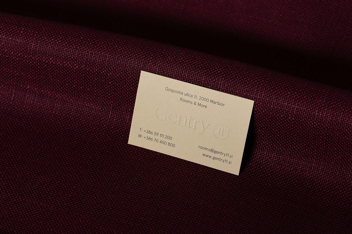
We were also driven by the desire to create a link between the old days and the new urban surroundings, where the street changes but the street numbers remain the same, tying us to the past. We selected a sandy color palette, which we combined with black, with the soft tones giving the logo elegance and nicely complementing the selected typeface.
Design: WDS — Portfolio photography: Sami Rahim — Styling: WDS
